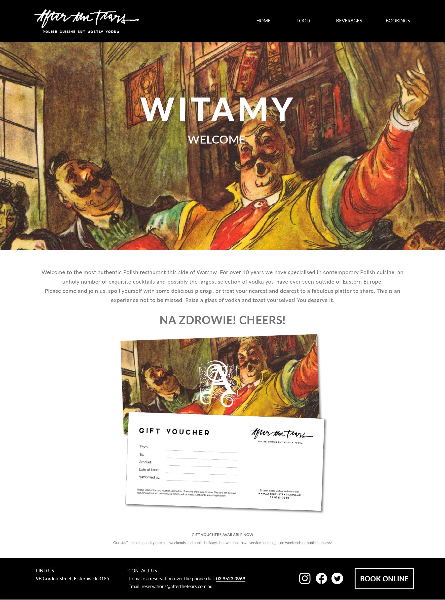


After the Tears
I was approached to develop a brand identity for an established Polish restaurant in Melbourne. The atmosphere in the restaurant is romantic and has a raffish charm and so I wanted to deep dive into Polish folklore and art to capture the essence of the restaurant’s culture and personality. These warm colours became the brands palette. I combined old world typography drop caps from classical fairy tales with classical handwriting to develop an aesthetic that captured that spirit but remained balanced.
Colour was important – the location and the artwork therein was so colourful, the designs needed to harmonise with that so I chose to go back to basics and use a very limited palette. Black and white against heavy colour supporting imagery.
The elements combine effectively and are timelessly bound within the traditional visual language of the fairy story, and old legend, but in a modern Polish restaurant serving rustic food...but mostly vodka.


Website
All food and lifestyle photography was my work. Social links and a marketing plan were also some of the work I developed to promote the restaurant.

Method
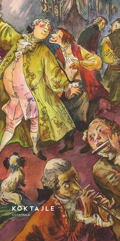
I like to go back to traditional media when roughing out an idea. I knew I wanted to reflect the magic in the illustrations by creating an old world fairy tale aesthetic. Huge drop caps and hand written lettering that spoke of times gone by. I filled an entire sketch book exploring the different ways in which I would do this. Below is a snap shot of some of those pages.